
Learn the basics of creating data visualization dashboards and choose the right tool for your project.
Data visualization is a way of showing results of data collection through visuals such as charts and graphs. Data visualization dashboards can be real-time, interactive expressions of data, or static representations of data collection.
When you work in Monitoring & Evaluation (M&E), survey research, or other fields that use mobile apps for primary data collection, it’s important to create effective data visualizations to convey your findings to stakeholders and collaborators — such as clients, investors, policymakers, and others who can take action based on the data you’ve collected.
In this article, we’ll review the basics of data visualization dashboards, and then give an overview of the tools we recommend for creating dashboards, and how to choose based on your specific needs.
How dashboards lead to better data quality
Dashboards aren’t just a fancy way to showcase your work. They actually have real implications for improving the quality of your data.
Dashboards can help you:
- Understand challenges on the ground and the quality of field data without waiting until data collection and analysis are completed.
- Help you track key performance indicators (KPIs) so you can make data-driven decisions.
- Makes monitoring raw data faster, easier, and more frequent. When all you need to do is quickly review a dynamic dashboard to see evidence of errors, you can easily incorporate this monitoring into your daily work.
- Minimize survey errors in the field because you’ll catch them earlier when you monitor data through a real-time dashboard.
- Harness better research and data insights than just using Excel.
- Provide ongoing feedback for enumerators so they can continuously improve.
- Track field work progress and always know what’s going on. Monitor and evaluate progress in real time.
- Share results with stakeholders, such as in monthly reports showing key data on subjects over time.
- Track phone call attempts or visits to households, businesses, clinics or other survey locations. For example, IDInsight automates household survey management for better data quality.
- Create custom applications, like Electronic Medical Record (EMR) systems.
Considerations when choosing how to visualize your data with dashboards
Who needs to see the data?
Data visualization is about making data understandable for your audience. So start by thinking about who will be looking at the data. Is this just for sharing internally with team members who are already deeply familiar with the context? Will you be sharing with no other context? Will you be sharing with external collaborators or clients who may not have any background in data collection or data analysis?
Some examples of dashboard use cases:
- Monitoring field work
- Longitudinal data collection
- Reporting to donors
- Stakeholder reporting
- Tracking key performance indicators (KPIs)
- MIS management
- Project management
Interactive vs. static dashboards
When choosing your tool and data visualization methods, you’ll want to think about dashboard design. A key consideration will be deciding between creating a static dashboard vs. an interactive dashboard.
Static data visualizations show a single relationship between the data. For example, a scatter plot chart showing the relationship between the number of household members and the average household income.
Interactive data visualizations allow the viewer to select different relationships between data and create custom views on the fly.
Considerations for working offline
If you are working in remote areas and need to monitor data regularly without an internet connection, you’ll want to find a data collection tool that works offline, and that also automatically syncs back to servers when internet connection does become available. This ensures the fastest transfer of data possible. You can also look for features that make it possible to transfer data between devices while offline, increasing the ways in which your data–and dashboards–can be updated.

Best tools for data visualization and how to choose one
In-platform data visualization tools
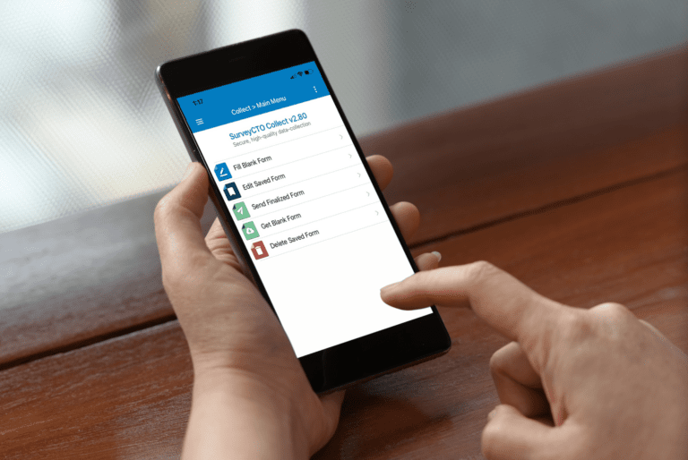
Some data collection tools have built-in tools for data visualization. If you’re using SurveyCTO for data collection, for example, the built-in Data Explorer lets you create charts and graphs, pull summaries from data, and show relationships between data. This is an easy and convenient way to quickly analyze your data.

Using an in-platform tool has pros and cons.
Pros of using an in-platform data visualization tool:
- It’s directly integrated with the platform you’re using to collect your data.
- You don’t have to find and set up a separate system, saving your team time and money.
- It’s dynamically connected to the data source, so there’s no lag time in getting up-to-date visualizations.
- Access management is easier to carry out on the same system, which means it’s easier to keep your data secure.
Cons of using an in-platform data visualization tool:
- Some platforms make it difficult to share with external collaborators (although with SurveyCTO, you can easily share with external viewers)
- In-platform data visualization tools often aren’t as powerful or robust as those specifically built for data visualization
If you’re looking for something more robust than the built-in tool your platform offers, you’ll want to integrate your data collection tool with a tool built specifically for data visualization. Luckily, with the right data collection tool, these integrations are easy to set up. Let’s look at the tools we recommend for creating powerful data visualizations.
Google Sheets
Google Sheets is an easy choice for many reasons — many people already have Google accounts and are familiar with Google products, so creating and sharing a central dashboard in Sheets is often seamless. It’s also easy to set up automations based on incoming data to Google Sheets, so you can connect your existing tools and eliminate tedious, manual work.
If you’re using SurveyCTO as your data collection tool, you can easily publish data to Google Sheets using its native integration.

Looker Studio (formerly Google Data Studio)
To create more sophisticated, dynamic dashboards, check out the free Looker Studio (formerly Google Data Studio). It’s fairly easy to use, and helps you create dashboards that are easy to interpret and share with collaborators of all levels of understanding.
Looker Studio offers a powerful but user-friendly platform with plenty of chart options for displaying dynamic or static data, including tables, bar and column charts, pie charts, and even map-based geo charts. Using a Google Sheet with data streaming from SurveyCTO creates a seamless integration for up-to-date data visualizations. If you don’t want to use a Google Sheet, you also have other options of data sources.
Looker Studio lets you create very simple or more complex dashboards, and gives you the option of adding and blending multiple data sources. It is not suitable for someone very new to data work and does not offer all possible options for visualizing more advanced data. Still, it’s a great option for those with moderate to good data visualization skills.

PowerBI
PowerBI is a system built specifically for creating powerful, interactive data visualization dashboards. It has diverse features, and can connect to hundreds of data sources to create visualizations. You can then share these directly with collaborators, or embed them directly into any other app or website.
You’ll find PowerBI especially useful if you’re doing longitudinal research or need to visualize data coming in from different forms. And if SurveyCTO is your data collection tool, we have a direct integration with PowerBI, so you can incorporate it seamlessly into your workflows.

DevResults
DevResults is a data visualization and reporting software built for M&E, especially organizations implementing international development programs and delivering humanitarian assistance. In addition to tools for building reports and dashboards, it also includes tools for data analysis.
Some of the visualizations you can create include:
- Dashboards that present project performance at-a-glance
- Visualizations of indicator results data
- Interactive maps with custom layers
- User-designed reports and tables
R
R is a popular free programming language and statistical environment. It’s simple to set up, and supports encrypted data, which is great for security. The R programming environment and its rich ecosystem of packages are well-suited for all sorts of data-related tasks, from data cleaning to statistical analyses to visualization.
If you already use R for programming and statistics, it’s a great tool to use for creating data visualizations, reports, or dashboards. We also recommend that you consider R as an integration option if the limitations of Google Sheets or an Excel file as a bridge are too constraining. You’ll find the R method to be quicker and easier than the Excel option described above, even if you’re not familiar with R.
If you collect data in SurveyCTO, you can use the R package (built by two users at The Agency Fund) to work with R and SurveyCTO data. And, if you use Power BI, you can run R scripts directly in Power BI Desktop and import the resulting datasets into a Power BI Desktop data model.
Tableau
Tableau is a data analytics and visualization tool, known for its easy drag-and-drop functionality. You can create interactive dashboards with Tableau.

Follow these best practices for data visualization
Dashboards can do a lot when it comes to organizing your data. But remember that there’s always a story behind the numbers. When the time comes to present your data, here are some tips to make it a success.
Tell a story. Data tells a story, so make sure you know what kind of story you’re trying to tell, and then ask yourself if your data visualizations are communicating that story effectively.
Keep it simple. Complicated data visualizations don’t impress — they just confuse and distract your audience. Find the simplest way to express your results. Have lots to display? Break your down into multiple dashboards.
Know your audience. The purpose of creating data visualization dashboards is to communicate with a given audience — whether that’s your clients, colleagues, or external stakeholders. So make sure you understand that audience’s level of understanding of the topic at hand, and how much context they need to understand the story you’re trying to tell.
Use a clear visual hierarchy. It’s easy to fill dashboards with seven different charts. Make sure it’s easy to understand where to look first, and which content is most important.
Use labels. Don’t leave it up to your readers to connect the dots for themselves. Use descriptive labels to tell a clear story.
Test data visualization with your audience. The best way to know if your dashboards are telling a clear story? Test with your audience!
Get feedback, tweak, and improve. Your goal is to communicate through data. Every time you share dashboards, get feedback, and then use it to improve the next iteration of your data visualizations. You’re doing great!


